Cumulative Flow Diagram: How to Read One (With Examples)
Turn this article into takeaways for your work.
Each assistant summarizes the article only for you and suggests best practices for your work.
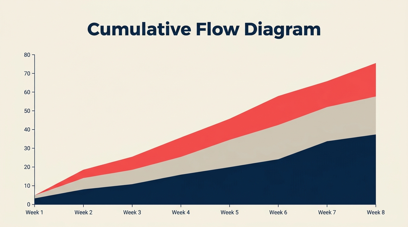
A cumulative flow diagram (CFD) is a stacked area chart that shows how many work items sit in each workflow stage on any given day, and how that distribution shifts over time. If you run a Kanban board or any flow-based process, it's the fastest way to see whether work is moving smoothly or quietly building up somewhere it shouldn't.
What Is a Cumulative Flow Diagram?
A cumulative flow diagram is a visual flow metric that plots the total count of work items that have entered each stage of a workflow as a colored, stacked band across a time axis. The vertical height of each band at any point in time tells you how many items are currently in that stage. The bottom band is typically the "done" state and grows steadily; the bands above it represent in-progress stages.
The CFD was popularized by David Anderson as a core Kanban metric. Unlike a burndown chart, which tracks remaining work against a fixed time box, a CFD measures flow continuously without requiring sprints or iteration boundaries.
Key Facts
- Teams using flow metrics like CFDs to actively manage WIP report up to 47% shorter average cycle times compared to teams that track only velocity (Kanban University State of Kanban Report, 2023).
- The average knowledge-work item spends roughly 85% of its total cycle time waiting rather than being actively worked on, a pattern that CFDs make immediately visible (Vacanti, "Actionable Agile Metrics," 2nd ed., 2023).
- Organizations that limit WIP guided by CFD readings cut their average lead time by a median of 37% within the first 90 days of adoption (Lean Kanban Inc. practitioner survey, 2022).
How to Read a CFD
A CFD has three things to look at: the bands themselves, the vertical gap between two curves, and the horizontal distance between points.

The colored bands. Each band represents one workflow state, stacked from bottom (done) to top (incoming/backlog). The height of a band at a specific date equals the number of items in that state on that date. A narrow, stable band means work flows through quickly. A band that fattens over time means items are accumulating.
Vertical gap = WIP. Pick any vertical slice through the chart at a single date. The gap between the "items started" curve and the "items completed" curve is your current work in progress. This maps directly to WIP limits: the gap should stay roughly constant. If it widens, WIP is growing and your process is taking in more than it finishes.
Horizontal distance = cycle time and lead time. Trace a horizontal line from the point where a batch entered the system to where it exited. That horizontal length is the average lead time for items that entered on that date. A shorter horizontal span means faster delivery. This is why a CFD is more information-dense than velocity alone: it shows you both throughput and the time dimension.
Band slope = departure rate. The steeper a band's upper edge, the faster items are leaving that stage. A flat upper edge means departures have stalled. If the "in development" band goes flat for a week, that's a clear signal: items are piling up and not moving to the next stage.
What a CFD Tells You About Flow
The chart's shape is diagnostic: stable bands signal healthy flow, while widening or stalled bands reveal where work is accumulating.

| Visual pattern | What it means | What to do |
|---|---|---|
| One band widens while others stay flat | Bottleneck in that stage | Investigate blockers, add capacity, or reduce WIP upstream |
| All bands rise in parallel | Healthy, stable flow | Maintain pace, watch for any divergence |
| Flat section across all bands | Work has stopped entirely | Check for external blockers, team absence, or a release freeze |
| Top "backlog" band steepens sharply | Scope creep or new work added faster than delivered | Revisit intake process, review prioritization |
| Gap between "started" and "done" widens | WIP is out of control | Enforce WIP limits, pause new work until backlog clears |
| Bands compress and converge near the right edge | Work draining down at end of project or quarter | Normal for fixed-deadline projects; watch for forced rushing |
The most actionable signal is usually the widening band. When you see it early, you can add a reviewer, swap a team member, or escalate a dependency before that stage becomes a deadline risk.
How to Create a Cumulative Flow Diagram
Most Kanban and project tools (Jira, Linear, Azure DevOps, Targetprocess) generate CFDs automatically. But knowing how to build one manually helps you understand what the tool is actually showing.

Define your workflow stages. List every state a work item can be in, from first intake to done. A typical software team might use: Backlog, Ready, In Development, In Review, In Test, Done.
Collect daily item counts per stage. At the end of each day, count how many items sit in each stage. Record this in a spreadsheet. You don't need exact timestamps; a consistent daily snapshot is enough.
Convert to cumulative totals. For each stage, add each day's count to a running total. This is the "cumulative" part: the chart shows total items that have ever entered (or currently sit in) each stage, not just today's snapshot.
Stack the bands. In your chart tool, create a stacked area chart. Place "Done" at the bottom, then each successive stage up to "Backlog" at the top. The x-axis is time; the y-axis is cumulative item count.
Set a consistent time horizon. A rolling 30-day CFD works well for active teams. Longer windows (90 days) reveal seasonal patterns; shorter windows (14 days) are better for sprint-length feedback.
Review with the team weekly. The CFD is most useful as a shared artifact. Walk through it in a retrospective or flow review. Ask: which band widened? What was happening in the process that week?
Connect it to your WIP limits policy. If you have explicit WIP limits on your Kanban board, the CFD is how you verify they're being respected. The gap should match your agreed WIP cap.
Common Problems a CFD Reveals
Bottlenecks. This is the CFD's primary use case. When one stage band fattens consistently while the others stay flat, you have a bottleneck. It might be a single overloaded reviewer, a slow QA environment, or an external dependency (like waiting for legal sign-off). The CFD doesn't tell you the cause, but it pinpoints the stage so you can investigate.
Scope creep. A CFD catches scope creep in a way that a burndown chart sometimes obscures. If the top of the chart rises steeply, new items are entering the system faster than items are leaving. On a burndown this might look like a flat line (new work offsetting completed work), but on a CFD the total chart height simply grows, making the intake rate obvious.
Blocked work. If a band goes completely flat, items have stopped moving through that stage. This could mean a team member is out, a dependency is unresolved, or work is waiting for a decision. The flat band is a visual "something is stuck here" signal that's easy to miss in a task list but impossible to overlook on a CFD.
Uneven input rates. If your "Backlog" band grows in sharp steps rather than smoothly, your refinement or planning process is batchy. Work arrives in big bursts rather than a steady flow, which usually leads to downstream crunch. Seeing this pattern is the first step toward smoothing intake.
Flow efficiency degradation. Over time, if the horizontal distance between "item started" and "item completed" grows longer, your overall cycle time is increasing. Teams often miss this because no single sprint feels dramatically slower. A CFD shows the drift over weeks.
CFD vs Burndown Chart
Both tools track progress over time, but they answer different questions.

A burndown chart asks: "Are we going to finish everything in this sprint?" It assumes a fixed scope, a fixed deadline, and measures remaining work against an ideal line. It's optimized for Scrum sprints.
A CFD asks: "How healthy is our flow?" It has no assumption of fixed scope or time boxes. It measures the distribution of work across stages continuously, making it better suited to Kanban and Scrum-Kanban hybrids.
The practical difference: if a sprint adds three stories mid-sprint, the burndown resets and the warning is subtle. On a CFD, the backlog band visibly steepens, and the effect on cycle time is immediately apparent.
Teams that use both tools get complementary signals: burndown for sprint-level commitment tracking, CFD for systemic flow health. If you already track story points via velocity, a CFD adds the time dimension that velocity alone doesn't show. You can read more about flow metrics like velocity at velocity in agile to see how CFD and velocity complement each other.

Senior Operations & Growth Strategist