プロダクト利用状況と顧客ヘルスの統合: CSとプロダクトが実際に共有するダッシュボードの構築
Turn this article into takeaways for your work.
Each assistant summarizes the article only for you and suggests best practices for your work.
CSがPMに電話せずに答えられず、PMがCS Opsリードに電話せずに答えられない質問があります。「プロダクトに深く組み込まれているにもかかわらず、ヘルススコアが悪化しているARR上位のアカウントはどれか?」
CSにはヘルススコアがあります。プロダクトには機能定着データがあります。どちらのチームも両方を組み合わせたビューを持っていません。B2B技術のNRR に関するMcKinseyのリサーチによれば、NRRトップクォータイルのパフォーマーは、プロダクト利用シグナルを遅行指標ではなく解約リスクの先行指標として扱っています。まさにそれが統合ダッシュボードを可能にする知見です。現在の答えは、誰かが2つのタブを開き、2つのCSVをエクスポートし、スプレッドシートで結合することを必要とします。それが実現する場合であれば。専用の顧客ヘルスモニタリングの実践がヘルス側のインプットを生み出し、このダッシュボードはそのインプットが初めてプロダクト側のシグナルと出会う場所です。
これが2つのダッシュボードの問題です。そして特定の盲点を生み出します。毎日ログインしているが同じ摩擦を繰り返し受けているアカウント、プロダクト利用アラートをトリガーすることなく満足度を侵食しているアカウント。あるいは、定着率が低いが強力なCSMとの関係を持つアカウント、CSMの離脱やアカウントの組織再編を生き残るほどプロダクトが深く組み込まれていないという事実を覆い隠しているアカウント。
統合ダッシュボードはこれを修正します。しかし、別々に維持する新しいダッシュボードではありません。両チームがすでに持っているデータの上に共有の解釈層を作るものです。最小限から始め、後で自動化します。
どちらのビューも単独では不十分な理由
CSヘルススコアはプロダクト文脈なしでは遅行指標です。CSMは関係シグナルに基づいてヘルススコアを割り当てます。最終コール日、NPS、サポートチケット量、QBRエンゲージメント。これらは正当なインプットですが、関係の質を反映するものであり、提供されたプロダクト価値の深さではありません。CSプラットフォームのGartner Magic Quadrantは、プロダクト利用の統合をCSプラットフォームのトップティアを最も差別化する機能として強調しています。なぜならそれがヘルススコアのみのモデルが見逃すシグナルだからです。アカウントはCSMとの強力な関係を持ちながら、プロダクトから価値を引き出せていない場合があります。CSMが去るか、アカウントのビジネス目標が変わると、関係に依存したヘルススコアは崩壊します。
プロダクト利用データはビジネスウェイトなしでは先行指標です。アカウント全体で機能定着率40%という情報は何かがおかしいことを示しますが、そのアカウントが2万ドルARRか40万ドルARRかは分かりません。プロダクトを40%の容量で使っているチームが更新を所有するチームかどうかも分かりません。プロダクトチャンピオンがCSMにギャップを指摘したのか、それとも黙って代替品を探しているのかも分かりません。セールス文脈を持つ顧客ヘルススコアリング(取引履歴、ステークホルダーマップ、拡大ポテンシャル)は、生の利用状況とヘルスシグナルをアカウント戦略に実行可能にする商業層を追加します。
どちらのチームも単独では答えられない質問: 「高利用率だがNPSが低いアカウントはどれか?」これらは毎日ログインしているにもかかわらず解約するアカウントです。プロダクトをワークフローに深く組み込んでいるため切り替えが辛いですが、何かが体験の中でベンダーへの信頼を侵食しています。より良い選択肢を見つけるか、痛みが切り替えコストを超えるまで留まります。
両チームが共に答える必要がある質問: 「プロダクト投資はどこでリテンションを最も改善しやすいか?」答えには、どの機能が高いヘルススコアと相関しているか、どの機能が低ヘルスアカウントで高い定着率を示しているか(機能は使われているが期待した価値を提供していない)、そして「解約しそう」なシグナルゾーンにいるアカウントのうち、特定のプロダクト修正や加速によってリテンションできるものはどれかを知る必要があります。
主要データ: プロダクト利用状況と顧客ヘルス
- **解約決定の43%**は、CSMが決定が保留中であるというヘルスシグナルを受け取る前に顧客によって行われています。統合されたプロダクト利用とヘルスデータがこのギャップを埋めることができます(Bain & Company、2024年)。
- プロダクト利用データとCSヘルススコアを組み合わせた企業は、CS割り当てのヘルススコアのみに依存する企業と比べてNRRが18%高いです。利用データには楽観バイアスがかからないためです(Totangoリサーチ、2024年)。
- **CSチームのわずか31%**が、データリクエストを出さずに対応できる形式でアカウントレベルのプロダクト利用データにアクセスできています(Gainsightの顧客成功ベンチマークデータより)。
- 高利用率・低ヘルスのアカウント(「フラストレーテッド・パワーユーザー」象限)は、ログイン頻度が同等にもかかわらず、高利用率・高ヘルスのアカウントの2.1倍の割合で解約します。これにより、CS・プロダクト共同介入が最も緊急なコホートになります(Totango、2024年)。
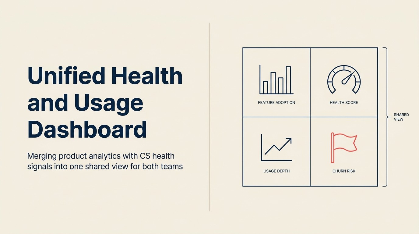
シグナルセット: 統合ビューに含まれるもの
すべてのシグナルが統合ダッシュボードに属するわけではありません。目的は両チームをより効果的にする最小限のセットであり、包括的な分析プラットフォームではありません。
プロダクト分析から(利用状況層):
- アカウントごとのコア機能定着率: プロダクトのコアバリュープロポジションに結びついた特定の機能を使っているか? すべての機能が均等ではなく、プロダクトでリテンションと相関する機能を重視します。アカウントレベルの使用状況追跡分析がこのシグナルの信頼性を高める上流の機能です。一貫したイベントレベルのデータなしには、定着率の計算はせいぜい推定値です。
- セッション頻度と深さ: ログインすることは価値を得ることと同じではありません。頻度(どのくらいの頻度で)と深さ(どのくらいの時間、セッションごとのアクション数)を組み合わせると、どちらの指標単独とは異なるストーリーが語られます。
- ワークフロー完了率: ワークフローを開始して途中でやめることは、全く開始しないこととは異なるシグナルです。一定のステップでの離脱は多くの場合、定着の問題ではなくプロダクトの摩擦の問題です。
- オンボーディング時の価値実現までの時間: アカウントの最初の意味のあるアクション(ログインではなく、プロダクトモデルで「価値を得ること」を定義するアクション)まで、どのくらいかかるか?
- コホート別機能アクティベーション: どのアカウントがどの機能をいつオンにしたか? コホート比較により、機能アクティベーションのペースがアカウントサイズ、セグメント、利用ケースによって異なるかどうかが浮かび上がります。
CSプラットフォームから(ヘルス層):
- ヘルススコア: コンポーネントのインプットが見えた状態での総合スコア(ブラックボックスの単一数値ではなく)。ヘルススコアモデルは企業によって大きく異なります。統合ダッシュボードのシグナル定義は、平行スコアリングシステムを作るのではなく、CSチームがすでに維持しているモデルと一致すべきです。
- NPSまたはCSATスコアとトレンド: 時点スコアはトレンドほど有用ではありません。6ヶ月間で8から6に移動しているアカウントは、6で安定しているアカウントとは異なるシグナルです。
- サポートチケット量とオープンチケット日数: 量はアカウントが摩擦に当たる頻度を示し、オープンチケット日数はCSがどれだけ速くループをクローズしているかを示します。
- 最終CSMタッチポイント日とセンチメント: 最後の意味のある接触からの日数、CSMからの定性的シグナルとしてのセンチメント。
- 更新日と更新リスクフラグ: 更新までの時間は緊急性を定義し、リスクフラグはアカウントを能動的介入ステータスにエスカレーションします。
- 拡大対縮小ARRトレンド: アカウントの商業的フットプリントが成長、安定、縮小しているか。
含めないもの:
- 個別ユーザー行動データ(プライバシーリスクとノイズ。アカウントレベルの集計が適切な分析単位)
- マーケティングアトリビューションデータ(異なるオーディエンス、異なる目的。マーケティング分析ビューに属する)
- セールスステージまたはパイプラインデータ(プリセール、このダッシュボードのスコープ外)
4象限: 利用状況とヘルスによるアカウントのセグメント化
フレームワーク: 利用状況・ヘルス アカウント象限 利用状況・ヘルス アカウント象限は、プロダクト利用深度(コア機能定着率、セッション頻度と深さ、ワークフロー完了率)と顧客ヘルス(NPSトレンド、総合ヘルススコア、更新リスクフラグ)の2軸でアカウントポートフォリオをセグメント化するフレームワークです。4つのコホートはチャンピオン(高利用、高ヘルス)、フラストレーテッド・パワーユーザー(高利用、低ヘルス)、関係依存型(低利用、高ヘルス)、解約リスク(低利用、低ヘルス)と名付けられています。各コホートには個別のCS対応が必要で、個別のプロダクト質問を生み出します。このフレームワークは、個別ユーザー行動データではなくアカウントレベルの集計を使用して、週次CS象限レビューと月次プロダクトコホート分析のために設計されています。
象限1: チャンピオン(高利用、高ヘルス)
これらのアカウントはプロダクトを深く利用しており、強力なヘルスシグナルを持っています。リファレンス顧客、潜在的なアドバイザリーボードメンバー、拡大ターゲットです。リスクは彼らを当然のこととして扱うことです。CSMは緊急性がないために彼らを後回しにし、プロダクトチームは課題を提起していないため無視します。
CS対応: 拡大シグナルを監視し、エグゼクティブエンゲージメントをスケジュールし、顧客アドバイザリーボードまたはリファレンスプログラムへの参加を検討します。 プロダクトの質問: チャンピオンが使っていて他のアカウントが使っていない機能は何ですか? このコホートがプロダクトの「良い状態」がどのようなものかを定義します。彼らの定着パターンがベンチマークです。
象限2: フラストレーテッド・パワーユーザー(高利用、低ヘルス)
これが最も緊急なコホートです。これらのアカウントはプロダクトをワークフローに組み込んでいます。運用上の混乱なしには簡単に離れられませんが、何かがおかしいです。NPSの悪化、サポートチケット量の増加、活発な利用にもかかわらず低下するヘルススコア。これらのアカウントは何かに不満を持ちながら代替品を探しています。
CS対応: CSMによる即時エンゲージメント。次の予定コールを待たないでください。積極的に連絡を取り、何が機能していないかを直接聞いてください。摩擦を特定のプロダクトエリアにマッピングします。 プロダクトの質問: これらのアカウントは何に当たっていますか? ヘルススコアが低下し始める時点での利用パターンは何ですか? このコホートはプロダクト優先順位付けにおいて最高の診断価値を持ちます。
高利用率・低ヘルスのアカウントは、ログイン頻度が同等にもかかわらずチャンピオンの2.1倍の割合で解約します。緊急性は利用データだけでは明らかではありません。リスクを浮かび上がらせるのはその組み合わせです。
象限3: 関係依存型(低利用、高ヘルス)
これらのアカウントはCSMとの強い関係を持ち、満足していますが、プロダクトはワークフローに深く組み込まれていません。CSMが注意深いから満足しているのであり、プロダクトが不可欠だからではありません。これは不安定な状態です。CSMの離脱、アカウントの組織再編、よりシンプルに見える競合他社の提案がこれらのアカウントを解約に向かわせる可能性があります。
CS対応: 利用率が低い理由を診断します。プロダクトがコアの利用ケースを本当に解決していないのか、それとも定着能力がギャップなのか(もっと使いたいが訓練されていない)? この区別が修正がプロダクト問題かオンボーディング介入かを決定します。 プロダクトの質問: このコホートでより深い定着を妨げている機能のギャップは何ですか? これらのアカウントは留まるほどにはプロダクト価値を検証していますが、スティッキーにする機能またはワークフローをまだ見つけていません。このコホートのそのギャップを埋めることで、関係依存型のリテンションをプロダクト主導型のリテンションに変換します。
象限4: 解約リスク(低利用、低ヘルス)
これらのアカウントには即時介入が必要です。低利用と悪化するヘルスは最も明確な解約シグナルの組み合わせです。問いはリスクがあるかどうかではありません。30日以内の介入が軌道を変えられるかどうかです。CSプラットフォームのワークフローに組み込まれた早期警告システムは、重大な悪化に達する前に解約リスクアカウントを浮かび上がらせることができます。統合ダッシュボードはシグナルを確認して文脈を与え、早期警告システムがアラートをトリガーします。
CS対応: VP CSにエスカレーションします。アカウントの日常的な担当者だけでなく、エグゼクティブスポンサーとの直接コールをスケジュールします。プロダクトがアカウントの利用ケースに失敗しているのか、オンボーディングが完了しなかったのかを特定します。 プロダクトの質問: この象限から解約するアカウントにとって、エンゲージメントをやめる前に最後に操作した機能は何でしたか? 離脱ポイントを理解することで、解約がプロダクトフィットの問題(何もすることがない)かプロダクトの摩擦の問題(修正するものがある)かを特定するのに役立ちます。
象限の運用化: 統合ダッシュボードの各アカウントには現在の象限割り当てがあります。CSは象限の移動を週次でレビューします。先週からチャンピオンからフラストレーテッド・パワーユーザーに(または関係依存型から解約リスクに)移動したアカウントはすべて、即時CS対応にフラグを立てられます。プロダクトは月次で集計象限分布をレビューし、プロダクトがアカウントをチャンピオンに向けて動かしているか、時間の経過とともに解約リスクに向けて動かしているかを理解します。
Reworkの分析: CSプラットフォームのベンチマークに基づくと、フラストレーテッド・パワーユーザー象限(高利用、低ヘルス)は、中堅市場SaaSで最も体系的に監視されていないコホートです。これらのアカウントはログイン頻度が同等にもかかわらずチャンピオンの2.1倍の割合で解約します。このリスクは利用データだけでは浮かび上がらず、活動指標は健全に見えるためヘルススコアのみのモデルは隠蔽します。統合ダッシュボードの主な価値は、ヘルスの悪化がCSMの介入を遅すぎてトリガーするのではなく、摩擦ポイントでこのコホートを可視化することです。週次で象限の移動をレビューし、チャンピオンからフラストレーテッド・パワーユーザーに移動したアカウントに即時CSMアクションを割り当てるチームは、更新会話ではなくシグナルポイントで遅延ステージの解約介入をインターセプトするため、後期段階での解約介入率が低くなると報告しています。
統合ビューの構築: 3つのツールオプション
オプションA: BIレイヤー(Looker、Metabase、Tableauまたは同等)
プロダクトデータベースとCSプラットフォームの両方から共有データウェアハウスに取り込みます。BIレイヤーがジョイン、アカウントレベルの集計を構築し、ライブダッシュボードとして象限ビューを表示します。
必要なもの: パイプラインを構築・維持するデータエンジニア(またはSQL能力を持つRevOpsリード)、プロダクトイベントデータをアカウントIDにマッピングするID解決(プロダクトイベントがアカウント識別子をネイティブに含まない場合、これが前提ステップ)、そしていずれかのソースシステムがデータモデルを変更した際の継続的なメンテナンス。
適切なチーム: 200以上のアカウント、活発なRevOpsまたはデータ機能、すでにアカウント識別子を含むイベントレベルデータを送出するプロダクトデータベースを持つチーム。
オプションB: CSプラットフォームエンリッチメント
Gainsight ScorecardsはAPIまたはスケジュールインポートを介してプロダクト利用データを取り込めます。ChurnZeroはAPIを介して利用イベントを受け取り、ヘルススコア計算に組み込みます。PMチームはCSプラットフォームに読み取り専用ビューを持ち、エンリッチされたアカウントレコードを見られます。
必要なもの: CSプラットフォームでプロダクトデータ統合を設定するCS Ops、CSプラットフォームを週次で確認することにコミットするPM OpsまたはPM(PMチームにとって自然な行動ではありません)、事前に定義されたデータ更新頻度(日次、週次、またはイベントごと)。
適切なチーム: 50から200のアカウントを持ち、統合機能を持つCSプラットフォームを持つチーム。このオプションはCS所有でエンジニアリングを必要としませんが、PMの行動変容が必要です。読み取り専用でもCSプラットフォームを使用することです。
オプションC: 共有スプレッドシートまたはNotionダッシュボード(週次手動プル)
CS OpsはARRの上位アカウントを週次でプルし、ヘルス層データで共有シートを手動で入力します。指定のPM(またはPM Ops)がそれらのアカウントの利用層データをプルし、隣の列に入力します。ジョインはスプレッドシートで行われます。象限割り当ては計算または手動で割り当てられます。
必要なもの: 2人の名前付きオーナー(ヘルス担当のCS Ops、利用担当のPM OpsまたはPM)、データプルのための週次30分の習慣、そしてシートを陳腐化させない規律。
適切なチーム: 100以下のアカウントを持つチーム、統合ダッシュボードの初期段階にあるチーム、またはオプションAかBへの投資前に概念実証を実施するチーム。忠実度は低く、レイテンシーは高いですが、機能し、より高度な自動化オプションがしばしばスキップする分類アライメントを強制します。
最小限の構成: アカウントごとのARR、ヘルススコア、1つのプロダクト利用指標(コア機能定着率)。共有シートに3つのデータ列、週次更新。これによりARR上位20アカウントの象限ビューが生まれます。ダッシュボードではありません。しかし、統合ビューであり、機能します。
所有権とガバナンス
誰が構築するか: RevOpsまたはデータ(アーキテクチャとジョインクエリ)、CS Ops(CSシグナル定義: ヘルススコアのインプット、更新リスクフラグの基準)、PM Opsまたは指定のPM(プロダクトシグナル定義: どの機能を「コア」とみなすか、セッション深さをどう定義するか)。
誰が維持するか: ヘルス層のCS Ops(CSプラットフォームの設定が変わるとヘルススコアのインプットが変わる)、利用層のPM Ops(プロダクトが機能を追加または廃止するとプロダクト機能の分類が変わる)、ジョインのRevOps(データパイプラインのメンテナンス、ID解決の更新)。
誰が読むか: VP CSは象限ビューを週次でレビューし、象限が変わったアカウントをフラグ立てします。Head of Productは集計象限分布を月次でレビューし、ロードマップインプットのためにコホートレベルのパターンを特定します。個々のCSMはアカウントごとのビュー(自分のアカウントの象限ステータス)を持ちます。PMは機能別コホートビュー(機能Xを使用するアカウントがどの象限にいるか)を持ちます。
ガバナンス: 四半期ごとのシグナルレビュー。問い: 利用指標は「高利用」を定義するのに依然として適切ですか? プロダクトはコア定着の定義を変える機能をローンチしましたか? ヘルススコアは再調整されましたか(新しいNPSアンケート頻度、新しいサポートチケットスコアリング)? 象限フレームワークはその基礎となるシグナル定義と同程度の品質しかありません。
ダッシュボードからアクションへ: CSとプロダクトが共同でビューを使う方法
週次CSレビュー: VP CSは前回のレビュー以降に象限が変わったアカウントをレビューします。低いヘルスまたは低い利用象限への移動は、24時間以内のCSアクションをトリガーします。CSMのアウトリーチ、アカウントが戦略的である場合はVP CSへのエスカレーション、移動がプロダクト主導に見える場合はPMリエゾンへのフラグ。週次レビューはダッシュボードが最新であれば20分で完了します。
月次プロダクトレビュー: Head of Productは集計象限分布と2つの特定のクロス象限分析をレビューします。チャンピオンが最も使っている機能(リテンションを促進するものがシグナル)と、フラストレーテッド・パワーユーザーが最も使っている機能(組み込まれているが壊れているものがシグナル)。これがプロダクトチームが次に何を修正するか対何を構築するかを特定するための最高シグナルのインプットです。
四半期計画インプット: 統合ダッシュボードは四半期顧客フィードバックレビューでのロードマップ優先順位付けの証拠基盤として機能します。フラストレーテッド・パワーユーザー象限のアカウント(高利用、悪化するヘルス)は、次の四半期に修正するものを特定するための最高シグナルコホートを代表します。それらのアカウントのARRウェイトと組み合わせたプロダクトレベルの摩擦パターンが、優先順位付けの基準に直接変換されます。
一般的な実装の失敗
誰もチェックしないダッシュボードの構築。 最も一般的な失敗。新しいダッシュボードが構築、発表され、既存の意思決定習慣につながっていないため6週間以内に使われなくなります。修正策: 新しいダッシュボードレビューミーティングを作るのではなく、既存の週次CSレビューミーティング(すでに行われているもの)に統合ビューを組み込みます。ダッシュボードレビューは常設の議題項目であり、新しい儀式ではありません。
アカウントにマッピングできないプロダクト利用データ。 プロダクトがアカウント識別子なしにイベントレベルのデータを送出する場合、ジョインはID解決ステップなしには不可能です。これはダッシュボードが構築された後ではなく、前に解決しなければならないデータインフラの問題です。修正策: オプションAかBにコミットする前に、プロダクトイベントデータにアカウント識別子(ユーザーIDだけでなく)が含まれているかを確認します。含まれていない場合、最初の実装ステップはダッシュボードの設定ではなくID解決です。
CSが信頼できないブラックボックスのヘルススコア。 ヘルススコアがコンポーネントが見えない単一の複合数値である場合、CSMとPMは数値が変動しても解釈できません。72から58に下がったヘルススコアは、NPSの低下、サポートチケットの急増、CSMの判断のどれによって引き起こされているかを知らなければ意味がありません。修正策: 複合スコアとともにコンポーネントスコアを表示します。NPSウェイト、サポート量ウェイト、CSM割り当てセンチメントウェイト。インプットの透明性が指標への信頼を構築します。
ダッシュボードが6週間以内に陳腐化する。 データ更新の名前付きオーナーなしでは、週次プルが止まります。ダッシュボードは40日前のデータを表示します。誰も信頼しません。統合ビューは別々のシステムに戻ります。修正策: RevOpsが更新頻度アラートを所有します。データが10日より古い場合、CS OpsとPM Opsリードに自動アラートが送られます。更新が行われなかった場合、オーナーは名前付きで、もし名前付きオーナーが利用できない場合はバックアップが指定されます。ビューが最新の状態を維持するようになったら、次の問いはCS・プロダクトの境界で重要な成果を生み出しているかどうかです。
CS・プロダクトの境界で重要な指標
4つの指標が統合ビューがデータだけでなく成果を生み出しているかを検証します。TSIAのCS現状2025は、CS組織が更新の先行指標として移行している指標として定着指標と成果主導のヘルスシグナル(NPSのみではなく)を特定しています:
更新コホート別機能定着率(更新前30/60/90日)。 更新するアカウントは、解約するアカウントより更新前90日間で一貫してコア機能定着率が高いですか? これが利用状況がリテンションを予測することの最も直接的な検証です。更新コホートと解約コホートの間で定着率が異ならない場合、「コア機能」の定義を見直す必要があります。
クレームから出荷修正までの時間。 日数で計測: CS主導のプロダクト摩擦問題がプロダクトバックログに入った日から、出荷された日、CSが影響を受けるアカウントと確認した日まで。この指標はループ全体を捉えます。この指標で60日の平均は、第1週に苦情を申し立てたアカウントが第9週まで返答を聞かないことを意味します。14日の平均は、フィードバックループが更新決定に影響するほど速いことを意味します。
象限別解約率(四半期ごと)。 各象限のアカウントの何パーセントが今四半期に解約しましたか? フラストレーテッド・パワーユーザーがチャンピオンの2倍の割合で解約しているが、CSチームが同様に扱っている場合、象限フレームワークは介入リソースをどこに再配分するかを示しています。四半期ごとに追跡し、2から3四半期のトレンドが特定の象限での介入が効果を上げているかどうかを示します。
四半期ごとのアカウント象限間移動。 低い象限から高い象限に移動したアカウントの割合は? チャンピオンに向けた純移動がCS・プロダクト共同努力の主要な成果指標です。停滞または負の移動は、プロダクト介入が効果を上げていないか、CS介入が適切なアカウントに届いていないことを意味します。
60日間のMVPプラン
第1週: VP CS、Head of Product、RevOpsとのワーキングセッションをスケジュールします。3つのプロダクト利用指標(コア機能定着率、セッション頻度、1つのワークフロー完了指標)と2つのヘルス指標(ヘルススコアとNPSトレンド)に合意します。書き留めます。各データソースを所有する担当者を名前で示します。
第2から3週: RevOpsまたはCS OpsがARRの上位20アカウントを手動でプルし、共有スプレッドシートに統合ビューを入力します。プロダクト分析から3つの利用指標、CSプラットフォームから2つのヘルス指標、そしてARR。各アカウントを象限に割り当てます。これは合計4から6時間かかります。
第4週: 次のCS・PM 1:1で象限ビューを提示します。ARR上位20アカウントの象限分布を確認します。フラストレーテッド・パワーユーザー象限の上位2から3アカウントを特定し、CSとPMのアクションを割り当てます。
第5から8週: 週次プルオーナーを設定します(ヘルス担当のCS Ops、利用担当のPM Ops、ジョイン担当のRevOps)。週次の手動プルを実施します。象限が変わったアカウントを追跡します。4週間後、手動プルが持続可能かどうか、または自動化が必要かを評価します。自動化が必要な場合、150以下のアカウントのチームにとっては通常オプションB(CSプラットフォームエンリッチメント)が次の適切なステップです。
統合ビューは完了すべきプロジェクトではありません。継続的な運用実践です。最小限の構成から始めてください。3列、20アカウント、週次手動プル。ARRウェイト付きフィードバック定量化プロセスとVoCパイプラインはどちらも同じアカウントレベルのシグナル品質に依存します。まず統合ビューを機能させてください。基盤が固まると、下流のプロセスが大幅に効果的になります。
よくある質問
利用状況・ヘルス アカウント象限とは何ですか?
利用状況・ヘルス アカウント象限は、SaaS企業のアカウントポートフォリオをプロダクト利用深度(コア機能定着率、セッション頻度と深さ、ワークフロー完了率)と顧客ヘルス(NPSトレンド、総合ヘルススコア、更新リスク)の2軸に基づいて4つのコホートにセグメント化するフレームワークです。4つの象限はチャンピオン(高利用、高ヘルス)、フラストレーテッド・パワーユーザー(高利用、低ヘルス)、関係依存型(低利用、高ヘルス)、解約リスク(低利用、低ヘルス)です。各コホートには個別のCS対応が必要で、個別のプロダクト質問を生み出します。象限はCSが週次、プロダクトが月次でレビューするよう設計されており、個別ユーザーデータではなくアカウントレベルの集計を使用します。
フラストレーテッド・パワーユーザー象限が最も緊急なコホートである理由は何ですか?
Totangoリサーチによれば、高利用率・低ヘルスのアカウントはログイン頻度が同等にもかかわらずチャンピオンの2.1倍の割合で解約します。緊急性は利用データだけでは見えません。アカウントはアクティブに見えます。NPSトレンドの低下やサポートチケット量の増加との組み合わせがリスクを浮かび上がらせます。これらのアカウントは切り替えが辛いほどプロダクトをワークフローに組み込んでいますが、何かが体験の中で信頼を侵食しています。より良い選択肢を見つけるか、痛みが切り替えコストを超えるまで留まります。統合ダッシュボードはこのコホートを更新会話ではなく摩擦ポイントで可視化します。
統合ダッシュボードの最小限の構成は何ですか?
最小限の統合ビューは、ARR上位20アカウントをカバーする共有スプレッドシートの3つのデータ列(週次更新)です。アカウントARR、ヘルススコア(CSプラットフォームから)、1つのプロダクト利用指標(プロダクト分析からのコア機能定着率)。これら3列から各アカウントの象限割り当てが生まれます。この最小データセットからの完全な象限ビューの構築は初回に4から6時間かかり、週次30分で維持できます。ダッシュボードではありません。統合ビューであり、機能します。150以下のアカウントのチームには、手動プルがその価値を証明した際にオプションB(CSプラットフォームとプロダクト利用データのAPI統合)が自然な次のステップです。
統合ダッシュボードに含まれるべきプロダクト利用シグナルは何ですか?
プロダクト分析から5つのシグナルが統合ビューに属します。アカウントごとのコア機能定着率(プロダクトのコアバリュープロポジションに結びついた機能、すべての機能が均等ではない)、セッション頻度と深さ(頻度はどのくらいの頻度か、深さはセッションごとのアクション数で、ログインと実際の価値抽出を区別)、ワークフロー完了率(一定のステップでの離脱は摩擦を示し、定着の失敗ではない)、オンボーディング時の価値実現までの時間(ログインだけでなく最初の意味のあるアクションまでの時間)、コホート別機能アクティベーション(どのアカウントがどの機能をいつアクティベートしたか)。含めないもの: 個別ユーザー行動データ(プライバシーリスクとノイズ)、マーケティングアトリビューションデータ(異なるオーディエンス)、セールスパイプラインデータ(プリセール、スコープ外)。
CSとプロダクトチームが統合ビューを使う方法はどのように異なりますか?
CSは象限ビューを週次でレビューします。先週から象限が変わったアカウント、特にチャンピオンからフラストレーテッド・パワーユーザーへの移動または関係依存型から解約リスクへの移動は、24時間以内のCSアクションを受けます。プロダクトは集計象限分布を月次でレビューし、2つのクロス象限分析に焦点を当てます。チャンピオンが使っていて他のアカウントが使っていない機能(リテンションを促進するものがシグナル)と、フラストレーテッド・パワーユーザーが最も使っている機能(組み込まれているが壊れているものがシグナル)。四半期ごとに、統合ダッシュボードは四半期顧客フィードバックレビューのための証拠基盤として機能します。高ARRのフラストレーテッド・パワーユーザーは翌四半期のロードマップ優先順位付けの基準に直接変換されます。
最も一般的な統合ダッシュボードの実装の失敗は何ですか?
4つの失敗モードが繰り返されます。第一は、誰もチェックしないダッシュボードの構築: 修正策は新しい儀式を作るのではなく、既存の週次CSレビューに統合ビューを接続することです。第二は、アカウントIDにマッピングできないプロダクト利用データ: アカウント識別子なしのイベントレベルデータではジョインが不可能で、ID解決ステップはダッシュボードの設定の前に来なければなりません。第三は、ブラックボックスのヘルススコア: コンポーネントが見えない複合数値は変動しても解釈できず、コンポーネントスコアを表示することで指標への信頼が構築されます。第四は、ダッシュボードの陳腐化: 名前付き更新頻度オーナーと、データが10日より古い場合の自動アラートが、統合ビューが6週間以内に別々のシステムに戻るのを防ぎます。
どのツールオプションがどのチームサイズに適していますか?
オプションA(BIレイヤー: Looker、Metabase、Tableauまたは同等)は、200以上のアカウント、活発なRevOpsまたはデータ機能、すでにアカウント識別子を含むプロダクトイベントデータを持つチームに適しています。オプションB(CSプラットフォームエンリッチメント: GainsightスコアカードまたはChurnZero利用イベントAPI)は、50から200のアカウントを持ち、プロダクトデータ統合を設定しPMにCSプラットフォームを週次でチェックさせるCS Ops機能を持つチームに適しています。オプションC(週次手動プルの共有スプレッドシート)は、100以下のアカウントまたは概念実証を実施するチームに適しています。最小限の構成はオプションCを使用します。3列、ARR上位20アカウント、週次30分で維持。
関連記事

Senior Operations & Growth Strategist
On this page
- どちらのビューも単独では不十分な理由
- シグナルセット: 統合ビューに含まれるもの
- 4象限: 利用状況とヘルスによるアカウントのセグメント化
- 統合ビューの構築: 3つのツールオプション
- 所有権とガバナンス
- ダッシュボードからアクションへ: CSとプロダクトが共同でビューを使う方法
- 一般的な実装の失敗
- CS・プロダクトの境界で重要な指標
- 60日間のMVPプラン
- よくある質問
- 利用状況・ヘルス アカウント象限とは何ですか?
- フラストレーテッド・パワーユーザー象限が最も緊急なコホートである理由は何ですか?
- 統合ダッシュボードの最小限の構成は何ですか?
- 統合ダッシュボードに含まれるべきプロダクト利用シグナルは何ですか?
- CSとプロダクトチームが統合ビューを使う方法はどのように異なりますか?
- 最も一般的な統合ダッシュボードの実装の失敗は何ですか?
- どのツールオプションがどのチームサイズに適していますか?
- 関連記事